Even More Satellite Data
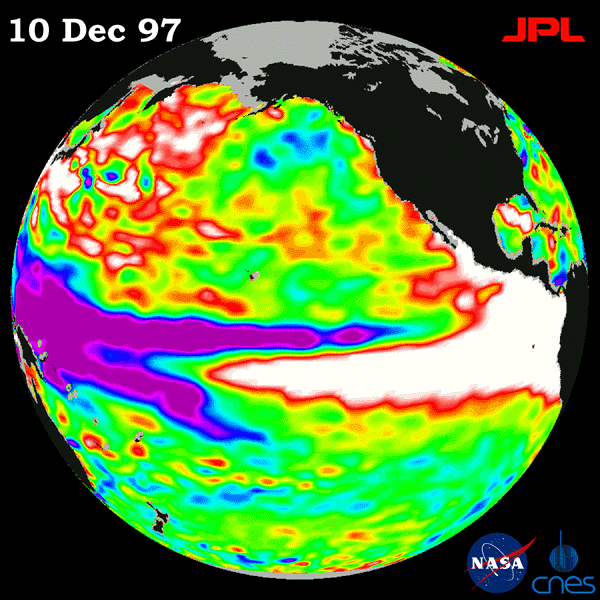
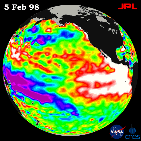
Figure 2: The above satellite photographs show the height of the ocean above or below normal on the given dates. White & red represent above normal while blue and purple represent below normal. Green indicates average conditions.
CONTINUE ANSWERING THESE QUESTIONS ON YOUR SEPARATE SHEET OF PAPER.
According to the satellite data over the entire 1997-1998 year, when would you say that the El Nino was the strongest? EXPLAIN WHY.
According to the data that you have observed today, why do you think that the El Nino phenomenon changes weather patterns (from their normal conditions) around the entire world? (Hint: Think about changes in air mass formation, air temperatures, and global circulation patterns)
If you were to look at similar satellite data (ocean height anomalies) in a non-El Nino year would you expect to see all green, more green or less green? EXPLAIN
Based upon what you have uncovered from this data, write a paragraph or two that explains:
"What is El Nino?"
Extension Questions:
Compare the normal vertical circulation off the coast of Peru (in South America) with an El Nino year. How are they different? Why do you think that Peru fishermen were among the first people to recognize the El Nino phenomenon.
How is Connecticut affected by El Nino? Support your answer by referring to the data with clear and complete explanations.
What other locations in the USA probably also experience a change in their normal weather patterns? EXPLAIN.